Designs
|
As a designer, it is my belief that each year must deliver a new message throughout the yearbook, and it is my job to connect the verbal explanation with the visuals, making it simple and cohesive for the reader. Although each book speaks in a different way, my voice as a designer holds consistent, prioritizing a modern, trend-setting look that pushes farther from traditional modular design and challenges the boundaries of basic design principles by combining bold typography with unique layouts.
As time goes on, readers find less and less interest in large copy blocks, which has inspired me to tell the same stories through a different viewpoint. By incorporating pulled quotes, captions rather than long stories, large number elements, and a multitude of photos, which the readers spend the most time on, I've been able to create engaging and exciting designs with out audience in mind. My voice shines through in all of my designs through my signature, |
clean style that utilizes white space to balance spreads with an abundance of content without feeling busy and overdone.
This year, our theme 'What You Make of It' inspired me even more throughout the design process by creating modules that specifically highlighted the steps of a process; by breaking down a typically long story into steps, each emphasized by bold numbers, readers could easily navigate the module without feeling overwhelmed, and would likely continue reading through until the end, as many would be motivated to "complete all the steps" and look at each number. With these small tricks, I used our bright color palette to again create many entry points for readers to keep them on each spread as long as possible. As I design each. year, I thrive on the challenge to come up with new ideas, a whole new personality, and a cohesive, purposeful book, without straying from my unique, modern voice and style. |
01. |
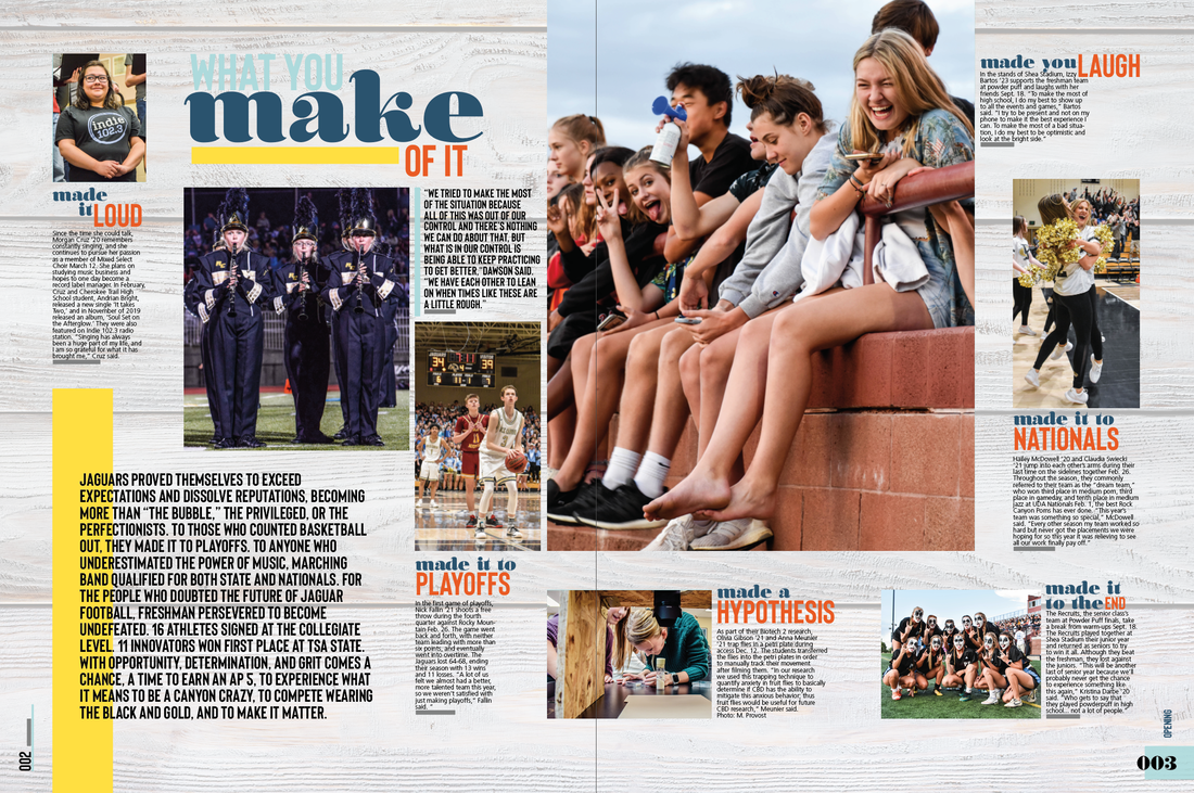
As the first spread to open the book, I wanted to create a design that stood out in comparison to a typical general coverage or sports spread, which caused me to integrate photos, captions, pulled quotes, and theme copy in a non-modular design with many elements to grab the eyes of the reader.
By implementing all four colors, along with the bar design element, on top of the wood grain background, I was able to bring in components that are used throughout the entire book onto one spread. It was my purpose to explain our theme, What You Make of It, through this design, which led me to use larger typography to emphasize different times we "made it" throughout the year along with the |
emotions these events made us feel.
The bar element is reflected throughout the book, so I chose our brightest color, almost a highlighter yellow, in order to bring the reader's eyes to our opening copy, which then explains the theme verbally. Overall, this design showcases photography that explains the highlights of the year in moments, which I then complimented with bold typography to get the reader to then look at the corresponding captions and stories. Then, I contrasted the captions with the single pulled quote, which perfectly defines the true meaning of this theme. |
02. |
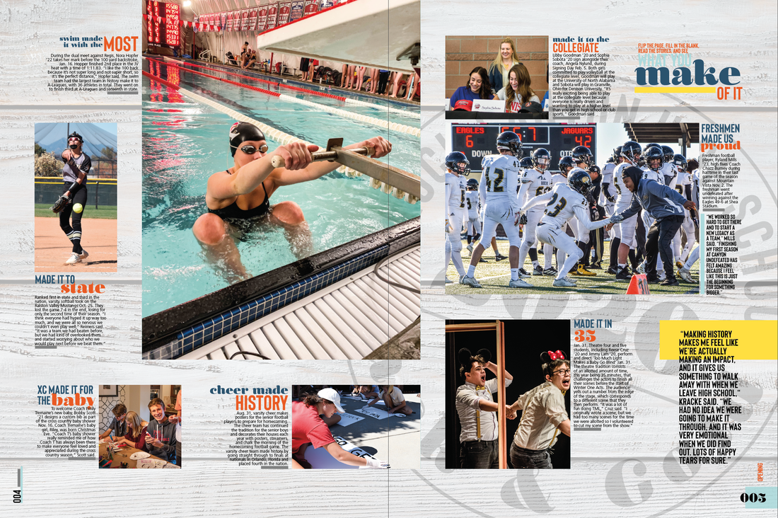
As the second and final opening spread, I incorporated the same overall design elements as the first, making sure to let the photography shine again. The vertical dominant photos in both spreads are also reflected throughout the book, and I chose to include the same headline package, which is taken from our cover and adapt it to a smaller version, since these two spreads are almost continuous as one.
I included another design element that is used in our book this year, which is the large stamp "engraved" onto the wood in the background, tilted to the right in order to point the readers towards experiencing the rest of the book. |
This stamp once again strengthens both the design and theme by connecting them altogether into a personal, unique, and permanent mark that represents the mark individuals have on our school, this year, and each other.
The yellow bar is also consistent and purposefully draws the eye towards flipping the page and continuing into the book. The bold copy it highlights is another quote which defines our theme, without the need of an explanation or written copy, which is why I chose to increase the weight of the font in comparison to the rest of the copy on the spread. |
03. |
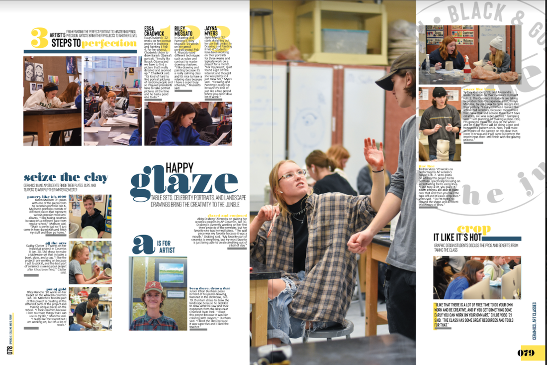
As a spread focused on art, I wanted to showcase not only the final products, but highlight the art "in the making," which is why I chose to create different modules to easily decipher different mediums and classes.
The vertical dominant adds hierarchy to the spread and provides purpose to the design, which uses the photograph to bring the reader's eyes up towards the corresponding secondary photos. Each caption clearly matches a particular photo, easing the work that the reader must do. With each module consisting of a clear headline and deck, the design successfully provides clarity and incorporates theme simultaneously. For example, the "3 Steps to Perfection" module reflects the |
component of theme that involves physically making things, and the steps to doing so. The colored numbers add interest to what would otherwise be long copy that may not have much interest.
Additionally, the bar element is incorporated into secondary headlines in order to provide clear margins for each specific module and allow proper and consistent white space to separate each topic and give the spread breathability. The stamp once again adds interest and another element of design to the spread, along with connecting the verbal and visual by emphasizing the artistic theme of the spread and representing the "makers" within our school community. |
04. |
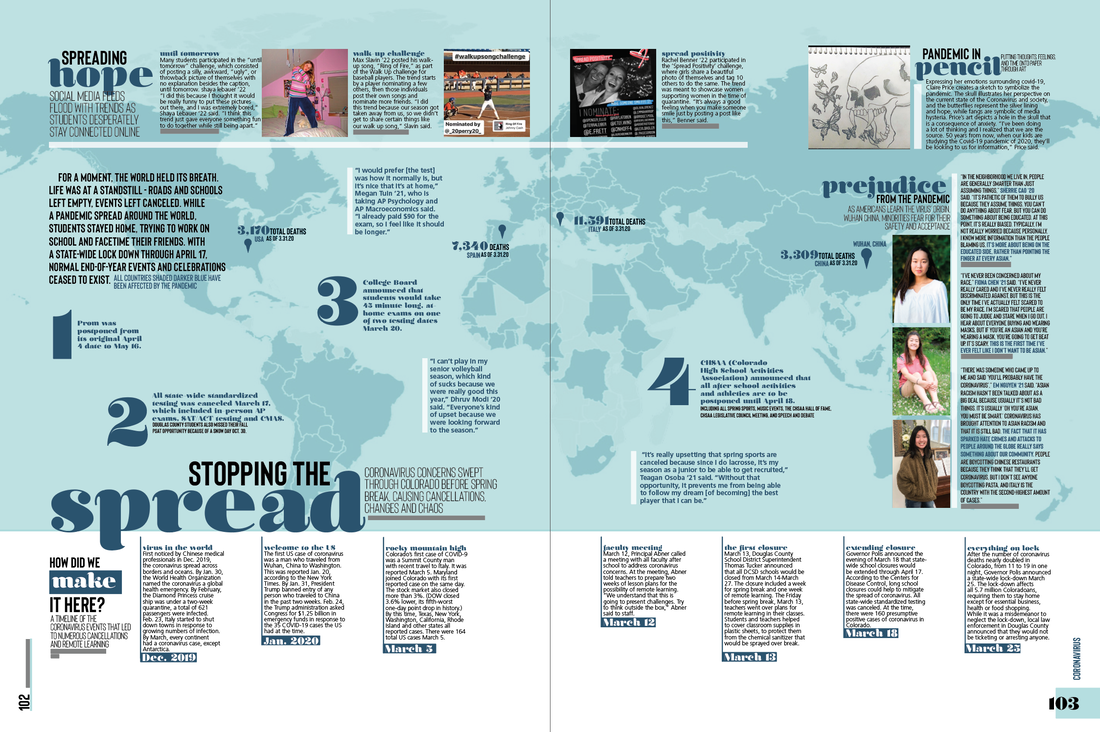
As one of the most important spreads in our book, and a spread everyone will be sure to look at, I wanted to create a design that continued our theme but also stood out against the rest of the book; thus, I layered a map of the countries affected by COVID-19 on top of a colored box, creating an effect that made the spread stick out because of the colored background. I was sure to allow the color to come down about 4/5 of the spread to avoid visually cutting the spread in half.
With so much information necessary on a coronavirus spread, I began with the background to add interest and visual elements in order to prevent an entire spread of copy, which is not appealing to most readers. The bottom module explains the most important events that took place involving the virus, which I connected to the map using colored lines. Originally, I had an area for a story, however I realized I needed to design the spread in a way that still included a story but not in the form of a large block of text. So, I broke up the story across the |
map. With the introduction in bold, readers know where to begin on the map, and this text explains the background information of how it all began. Then, I used large numbers in a separate font to guide the reader across the spread, learning all the different ways COVID-19 has affected our community. I added different pinpoints along the map to incorporate facts which explain how many people have died in each country because of this pandemic.
I also included a sidebar on the right, with student faces and pulled quotes, to accurately highlight the voices of our school, many of which feel are experiencing racism. The mods at the top of the spread bring another side of coverage and include uplifting topics in ways that students have made the most of it, by drawing or going to social media. Overall, although this spread has no dominant photo, the hierarchy and dominance comes from the large graphic and the dominant headline, which then lead to each topic area. |
05. |
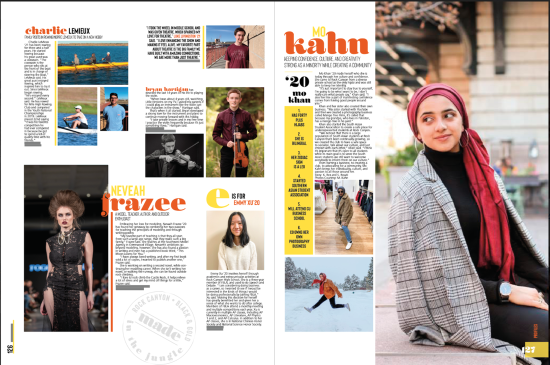
In this year's book, we decided to implement a profile section, which included six spreads that tell the stories of individuals that make up our school. As I designed this spread, I knew a modular design was necessary to clearly illustrate one student's story from another. I chose to incorporate the vertical dominant photo again, which holds an environmental photo that speaks to the personality of the profile's subject. I then reflect the vertical element in the form of a colored bar, which gives fast facts about Mo Kahn, adding another point of entry for the reader to the story.
I used white space to clearly separate each individual profile and subtly added the stamp in |
the bottom left to fill the space without competing with Neveah's profile.
I used color to highlight the names of the students on the spread and used lines throughout to properly align to story with the photos that correspond to it. Rather than sticking to a single photo with a story for every person, I varied the way the stories are told by combining short stories, pulled quotes, short stories, and the fact bar. This way, the reader stays interested and continues finding all the entry points to each profile. I used the dominant photo to lead the readers to the rest of the spread, as her eyes look towards the rest of the content. |
06. |
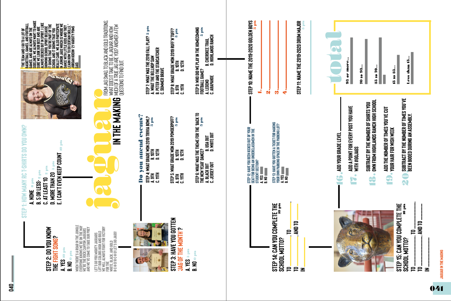
At the beginning of the year, I knew I wanted to incorporate a few vertical spreads throughout the book to vary the design and surprise the reader. The design requires the reader to stop, rotate their book vertically, and then continue to investigate, which is why this spread is intended to be written all over, filled in, and made their own. I chose the incorporate a very large headline to indicate where to begin on the spread. The concept overall is "jaguar in the making," which is essentially a quiz for students to fill out and find
|
out how much of a true jaguar they are.
This design was tricky, considering the bulk of it is copy, so I chose to use all four colors, showing the playful side of the spread. I used black lines to guide the reader from start to finish and added a few photos throughout in order to add another visual element. Finally, I created a "total box" using the bar elements once again to provide a clear start and finish to the quiz. |
|
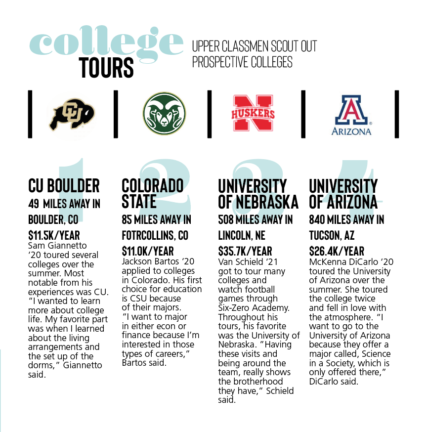
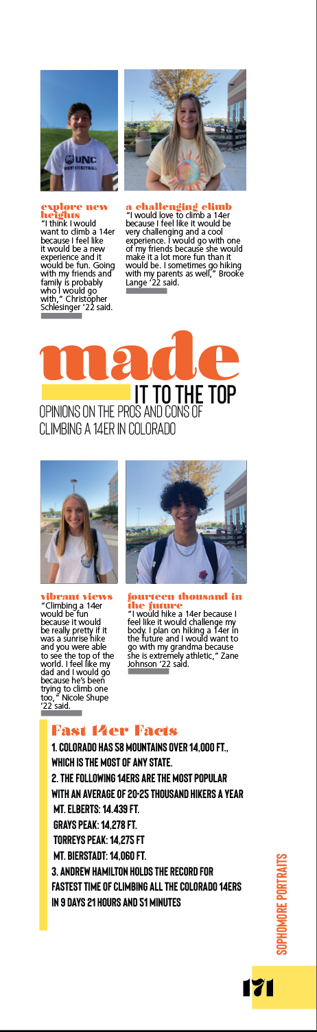
07. Inspired by the step-by-step concept rooted in this year's theme, I chose to create a multifunctional module that could be used for 4 steps to complete a task, 4 different athletic positions, 4 difference voices on one subject, or in this case 4 different colleges that students visited over the summer.
I chose to utilize the bar design element in a different way by separating each logo with short lines with the intentions of creating columns without having to literally separate each section from top to bottom; this way, I would create more room for white space to help carry through the modern, clean look. By designing the text into skinnier columns, I strategically tricked the reader's eye to make there appear to be less text. I incorporated color to bring the reader's eye from the headline package to the important information, including quick facts. With the small bits of detail that provide readers with a fast read (school, location, tuition), I chose to bold the typeface in order to differentiate it from the caption. |
|
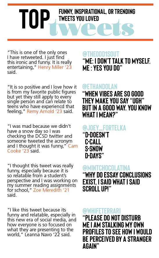
08. Starting with the headline package, I embedded each piece into the other by working with our two fonts, Olivia and Bison. I then used lines to add color to the module while clearly separating the headline package from the rest of the information. With the topic being about tweets, i pulled the blue from the headline to emphasize the twitter handles, thus drawing the reader's eye down where each tweet is listed in bold. To add attention to the voices of the module, I contrasted the teal by highlighting each student name in orange, emphasizing it amongst their individual quotes.
|
|
09. When designing this sidebar, I wanted to create a layout that included environmental photos, captions, and fast facts in a unique presentation. I created a new headline package that implemented the bar design element and clearly crated hierarchy through typography. I then varied the sizes of the photos in order to add interest and hierarchy once more. By coloring the lead ins to each caption orange, I bring the reader's eye from the headline package to each featured student.
Lastly, I added a list of fast facts at the bottom in bold in order to provide an area for additional content that readers can receive information from quickly. The yellow bar in the headline ties into the bar near the fast facts, which goes downward, drawing the reader to go through the entire list of facts. This sidebar is another example of how I took the inspiration of steps and lists to create designs that reflected the theme, What You Make of It, while simultaneously guiding the reader to stay on the page for as long as possible, taking in as much of the content as possible before losing interest. |
